Woohoo!! Yes, you are in the right place, it just looks a bit different: the Lana Red Studio blog underwent a major transformation today!
www.lanared.blogspot.com –> www.lanaredstudio.com
I have been working on the new blog layout design for the last month (thinking about it for the last year:) and today is finally the day to share it with you! Oh, I am so excited, I am jumping up and down as I am writing this post!
Your first reaction will probably be: why? I mean the blog was perfect right;)
Well, I personally felt that it was time for a change. I started this blog knowing nothing about webdesign, blogs, html, etc. And I have learned so much over the last two years, making the feel of the the blog more and more like the ‘old’ Lana Red instead of the person who I am today. My projects never really transformed (maybe the pictures got better) but I am still sewing, baking and crafting away. But the way that I presented my work and projects just didn’t feel like ‘me’ anymore.
I also wanted to switch from blogger to wordpress. Yes, I am one of those people that still used a blogger blog. It was the best way to start my blog, because it doesn’t work with easy plugins, instead you have the write all of the code yourself(!) Sounds difficult (and believe me, it was!) but it also thought me a lot! I mean I feel so cool right now, knowing how to design my own blog. But a few months ago I found the design limits becoming to time consuming and decided to move everything to a self hosted wordpress site.
But the biggest reason for starting this new chapter is you! I felt that I wasn’t sharing my projects enough with you, I had one scroll bar and some archive pages, making it very hard for you guys to browse through my projects and posts. I have been wrecking my brain on how to make it more user friendly and hope that you will be happy with the new lay out.
And with a new lay out, come new pages!
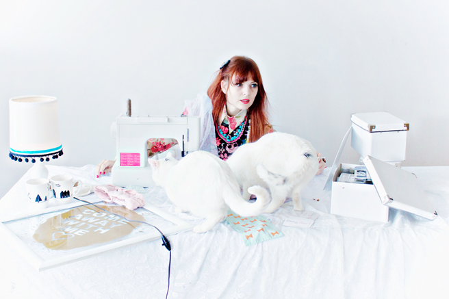
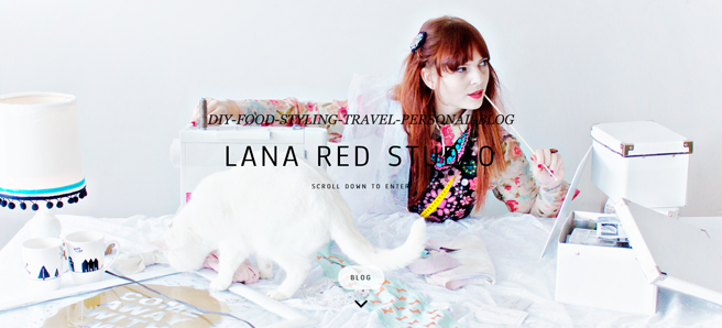
Let’s start with the first one, because it’s kinda hard to miss: the frontpage! My main goal in the new lay out is more images. I want to make it easier for you to find your way, without having to read to much. Because, aren’t wel all just here to make visually stunning things?!
From here, you can choose to go directly to the blogroll or scroll down and enter the home page.
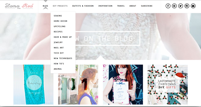
All of the DIY projects, tutorials, how to’s and recipe are all divided in the “DIY Projects” dropdown menu on top of the blog.
The blogroll can be found in the top menu. All of the posts are in there, you just have to scroll down! (You can also find the newest posts on the home page, if you are a regular reader and want to keep up)
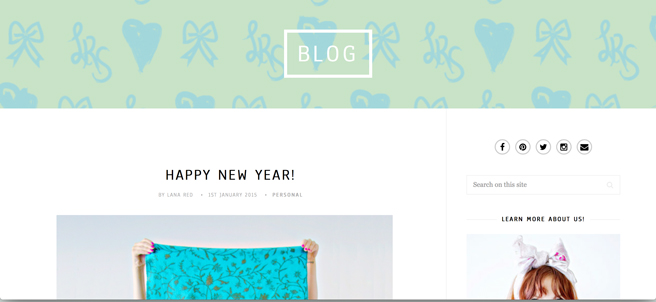
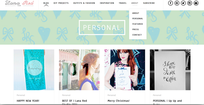
I wanted to share more of my personal life with you and made a few new pages: Personal, About & Featured. Here you will find all of my more personal articles and behind the scenes stories.
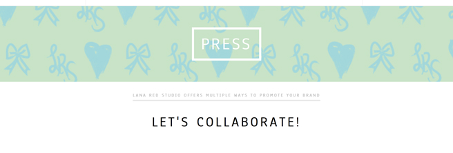
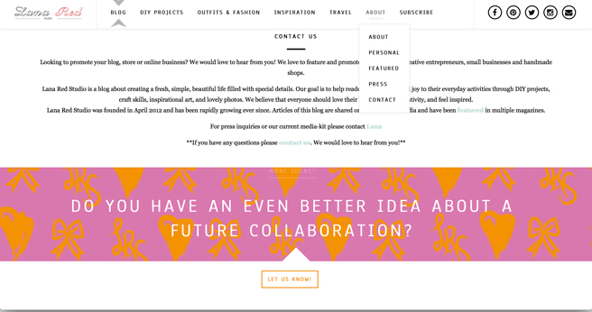
My favorite new page is the “Press” page! Because I love collaborations! It means that I can host fabulous new giveaways for you guys and girls and learn more about new brands to make my crafting days even better!
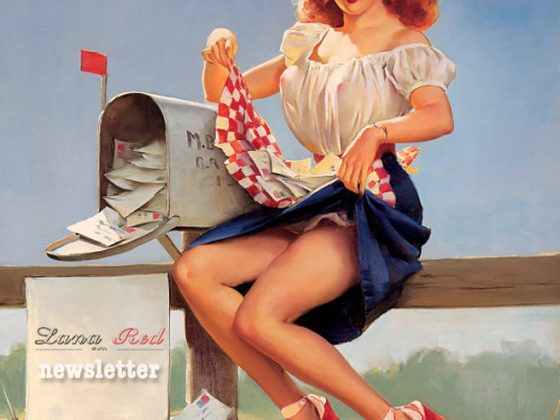
And the thing that I found most important is for you to find me. Not to gain more followers, but to have more interaction with you. That is why you can always contact me by email or subscribe to my newsletter (where there is always a personal note and a link to reply to that months newsletter).
I know, it’s a lot of information:) I hope I didn’t overwhelm you and scared you off. I just hope that you will enjoy all of the new features and keep coming back for the projects or just to say hello. Because this would all not be here if it wasn’t for you!

